WorkBranding
Wild North Events
Wild North Events
A logo and brand direction with a Northern Ontario sense of place and the flexibility to represent many kinds of events.
Project Overview
Wild North Events needed a visual identity with a clear sense of place and enough flexibility to represent a range of events.
I developed the logo system and supporting brand direction around a Northern Ontario-inspired visual language, then carried it into social media graphics.
Design Approach
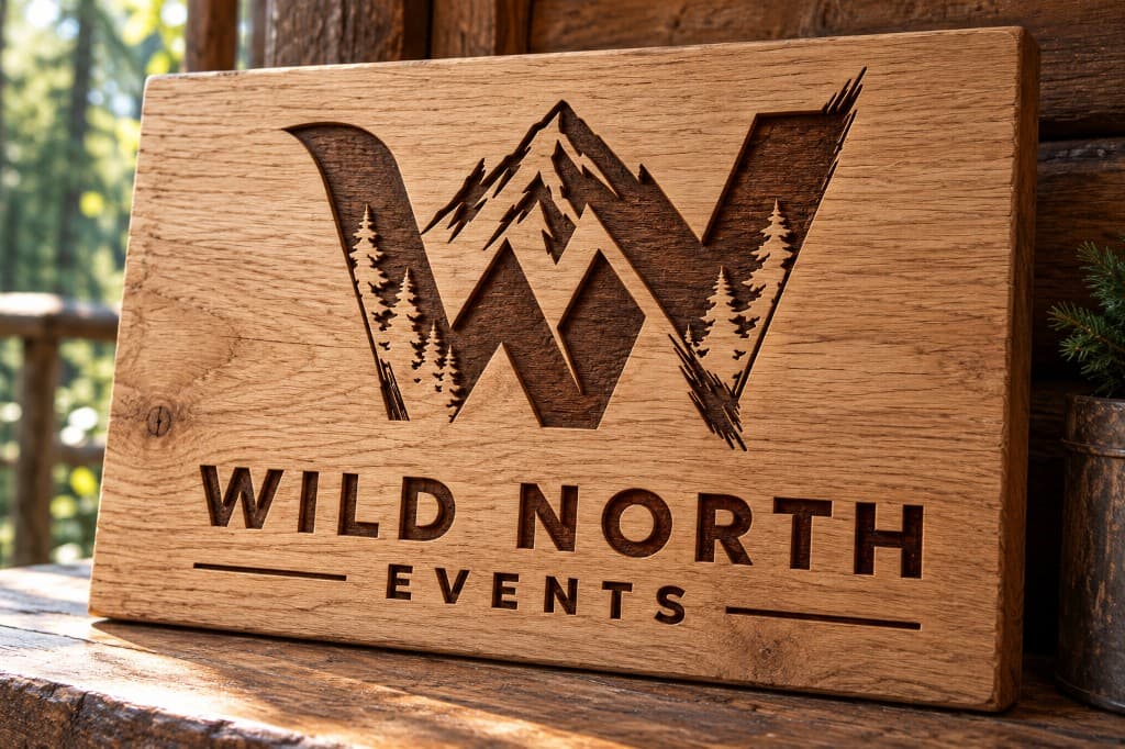
The identity explores the relationship between letterforms and landscape while keeping the selected mark legible and adaptable. The final mark folds a mountain peak and a treeline into a WN monogram, paired with a clean geometric wordmark.
- Logo exploration
- Wordmarks and WN monograms tested different ways to integrate a treeline and horizon into the letterforms.
- Northern cues
- Trees and a mountain ridge connect the identity to place without requiring a literal landscape illustration.
- Brand system
- Colour, typography, and logo variations bring the chosen direction together into something the client can use consistently.
Logos and marks
Standalone artwork, shown at its own proportions. Photographs and mockups of the work in use appear elsewhere on this page.
Primary logo 
Primary logo with tagline 
Standalone mark 
Script wordmark, a secondary lockup for more casual applications 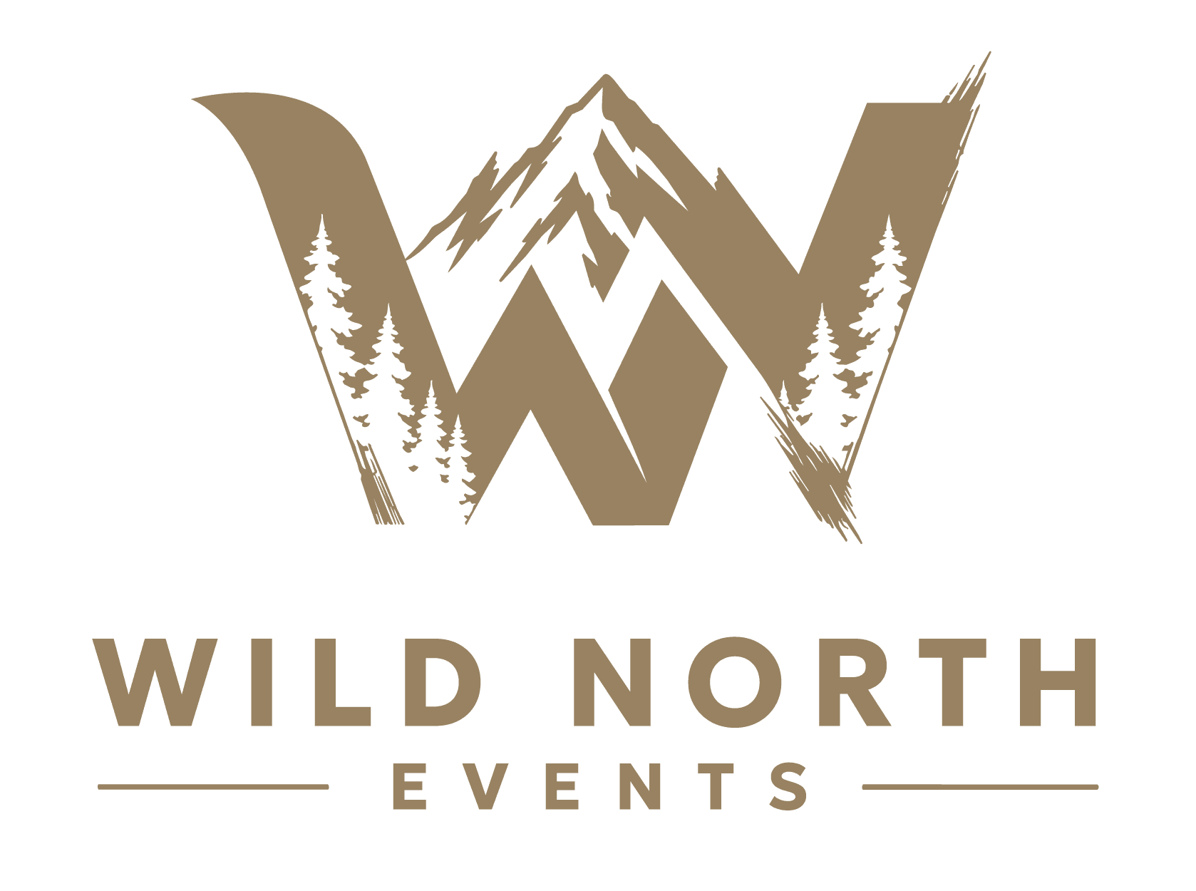
Primary logo, gold
Applications
- Primary logo with WN monogram
- Standalone WN mark
- Script wordmark, with and without tagline
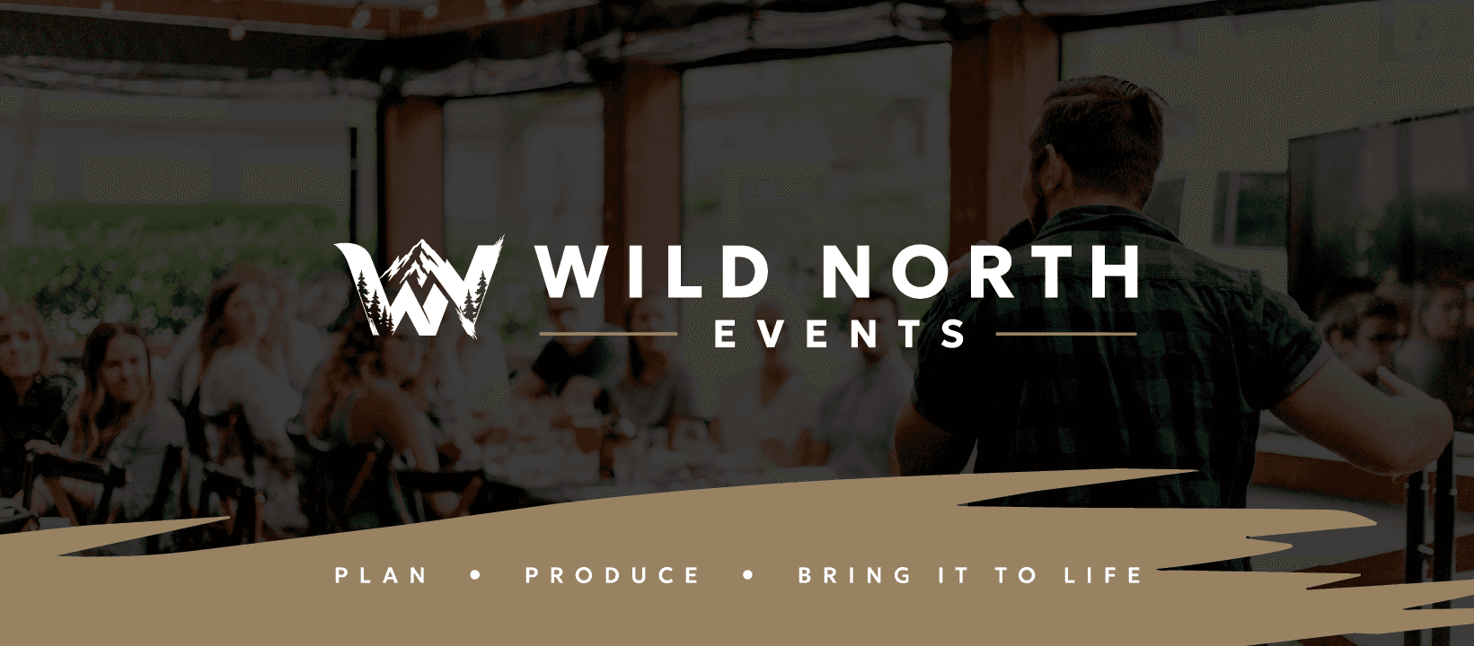
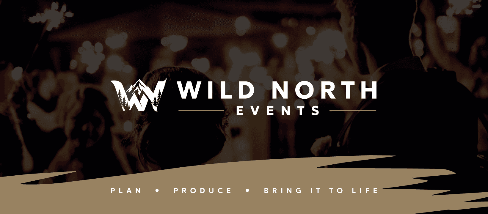
- Tagline lockup: “Plan | Produce | Bring it to life”
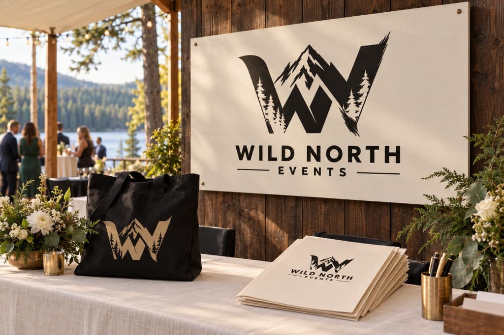
- Black, gold, and white versions
- Social media banners
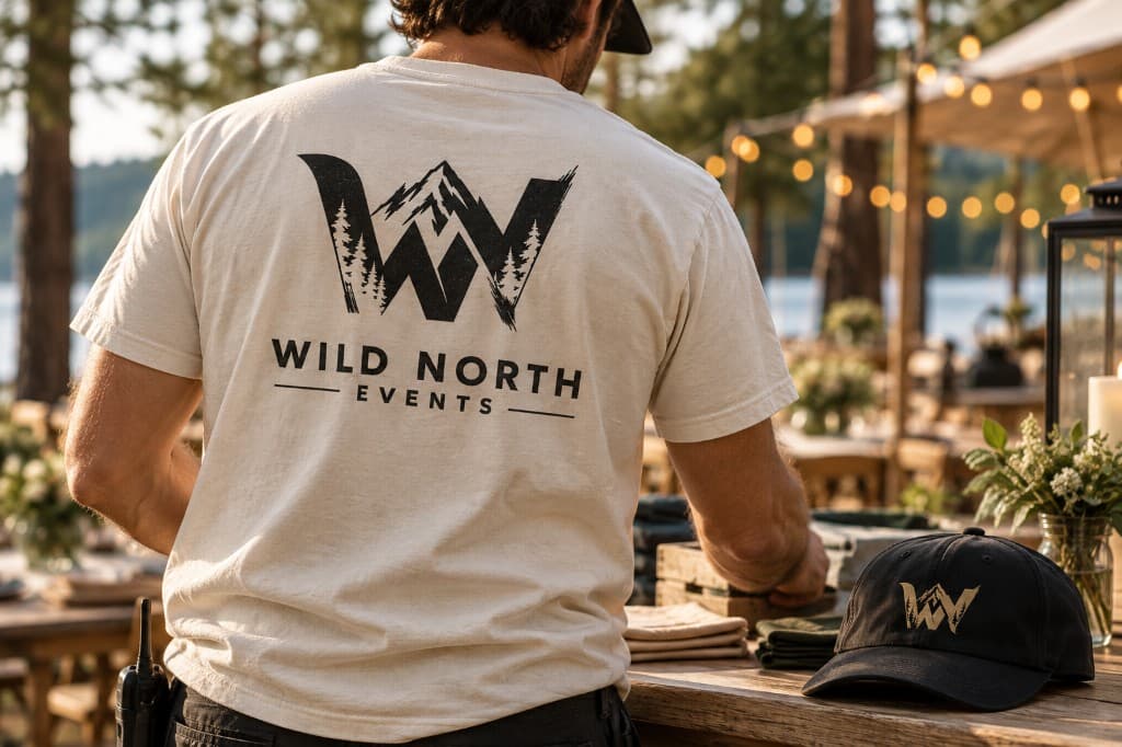
- Event signage, stationery, and apparel mockups
Outcome
The identity gives Wild North Events a recognizable starting point for its event brand, with a mark that can work across different sizes and settings.