WorkBranding, Print
Sturgeon Tire & Sturgeon Auto Parts
Sturgeon Tire and Sturgeon Auto Parts
Two related identities for two businesses under new ownership, carried into signage and a social media launch.

Project Overview
Under new ownership, Sturgeon Tire and Sturgeon Auto Parts needed distinct but related identities and a clear way to introduce both businesses to their community.
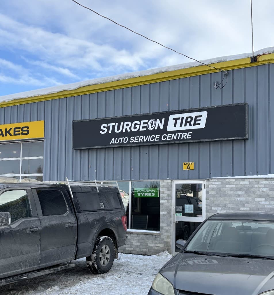
I designed both logos and carried the visual direction into signage and a social media rollout that announced the change of ownership.
Design Approach
The two marks share a confident automotive character while giving each business its own symbol and name recognition. A customer should read them as siblings, not twins.
- Related identities
- An angled tire motif distinguishes Sturgeon Tire; a speedometer-inspired mark identifies Sturgeon Auto Parts.
- Signage
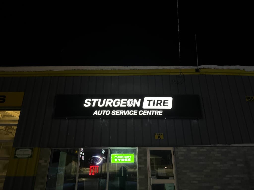
- Layouts consider visibility on the building and on the roadside sign, where the marks are read at speed and from a distance.
- Launch sequence
- Social content introduces the ownership, team, services, and giveaways in a consistent visual style so the announcements read as one story.
Logos and marks
Standalone artwork, shown at its own proportions. Photographs and mockups of the work in use appear elsewhere on this page.

Sturgeon Tire, primary logo 
Sturgeon Tire, stacked 
Sturgeon Auto Parts, primary logo in full colour 
Sturgeon Auto Parts, one-colour 
Sturgeon Auto Parts, stacked
Applications
Identity
- Two logos with print and digital variations
Signage
- Building and roadside signage designs or mockups
Social launch
- New-ownership announcements and team introductions
- Service, giveaway, reminder, and winner graphics
- Facebook profile and cover graphics for both pages
Collateral
- Business card mockups for both businesses
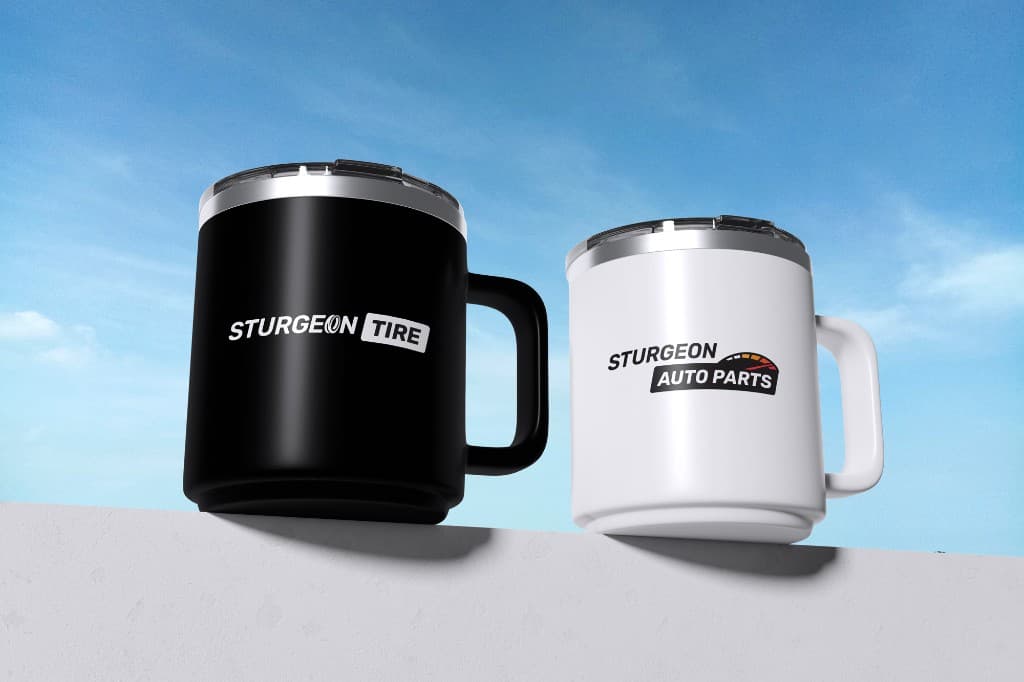
- Branded mug mockups

Outcome
The combined system gives both businesses a clearer public-facing identity and a consistent visual language for their signage and launch communications.
More from this project
Select an image to view it at full size.
The team under the new Sturgeon Auto Parts sign
Roadside pylon, second view
Sturgeon Tire Facebook cover and profile
Sturgeon Auto Parts Facebook cover and profile
Sturgeon Tire business cards, presented as a mockup
Sturgeon Tire card faces, presented as a mockup
Sturgeon Auto Parts business cards, presented as a mockup
Sturgeon Auto Parts card faces, presented as a mockup
Mug mockups, black
Mug mockups, blue