WorkBranding, Print
Haworth Telecom: Branding & Stationery
Haworth Telecom
A refreshed identity and stationery system for client-facing communications as the company expanded its services.
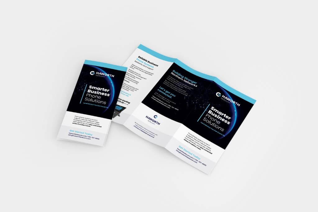
Project Overview
As Haworth Telecom expanded its services, its business materials needed a consistent and current presentation.
I worked on a refreshed identity and stationery system for client-facing communications.
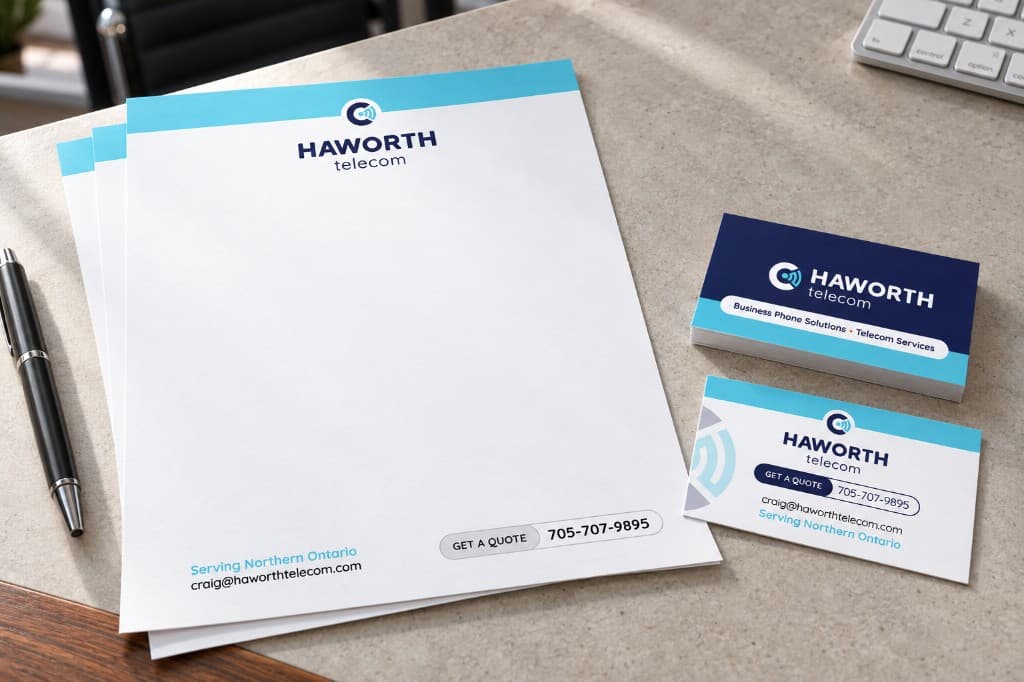
Design Approach
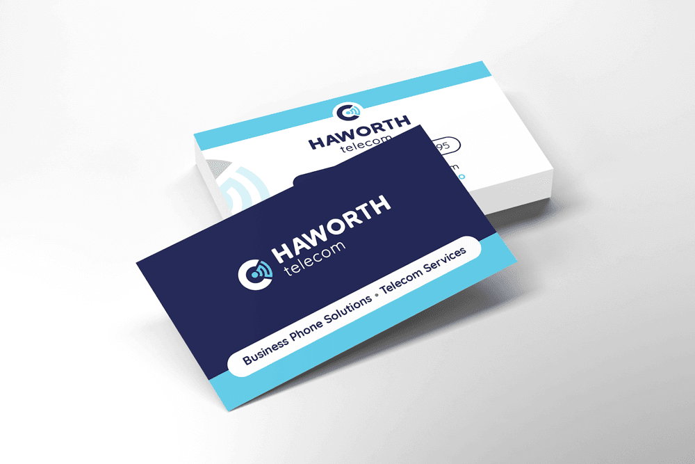
A navy, white, and light blue palette, readable typography, and technology-inspired details give the materials a clear visual relationship without making them difficult to use.
- Identity
- Modern wordmark and supporting visual elements.
- Print hierarchy
- Contact information and partnership details remain easy to find.
- Cross-channel consistency
- Digital templates extend the same system beyond printed stationery.
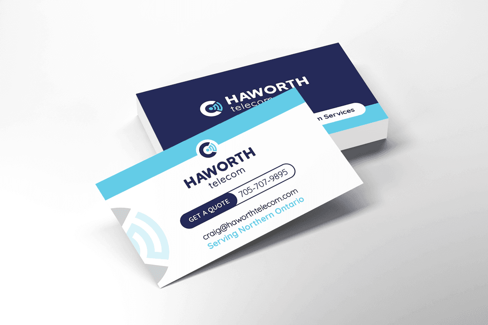
Applications
- Business cards
- Letterhead, envelopes, and presentation folders
- Email signatures and digital templates
- Logo and brand presentation files
Outcome
The system gives Haworth a coherent set of materials for proposals, correspondence, and day-to-day communication.
More from this project
Select an image to view it at full size.
Brochure outside mockup
Brochure outside
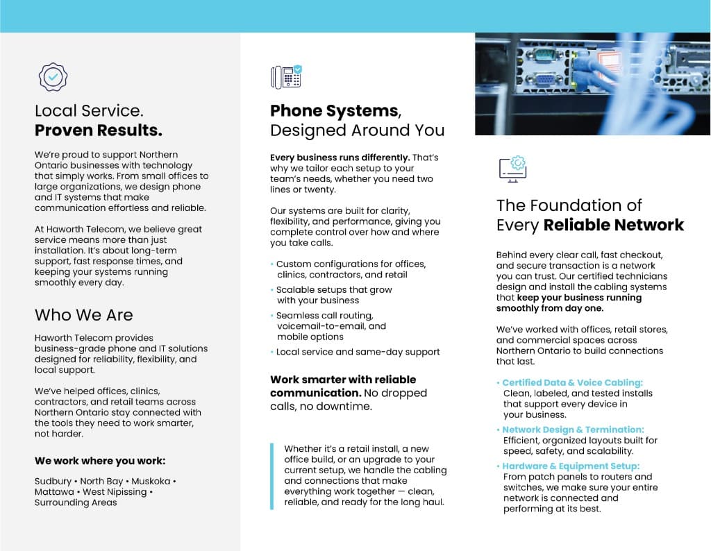
Brochure interior mockup